
This month, we take a look at Pantone’s colour of 2020 and explore how its influence can be seen in interior design.
The Pantone system is the world’s leading colour reproduction scheme, providing a simple way to classify colours. Created in the 1960s as a method of ensuring accurate printing and reproduction, Pantone is now the go-to language of colours amongst designers, printers and producers.
Pantone launched their first Colour of the Year in 2000, and over the following 20 years it has become an important moment in the annual industry calendar. Pantone’s experts analyse trends across the world looking at areas that impact colour – from areas as diverse as fashion, films in production, politics, activism, art, and even cultural events that capture the zeitgeist. Pantone draws on this ‘colour intelligence’ to forecast the hue it believes will sum up the world in the year ahead.
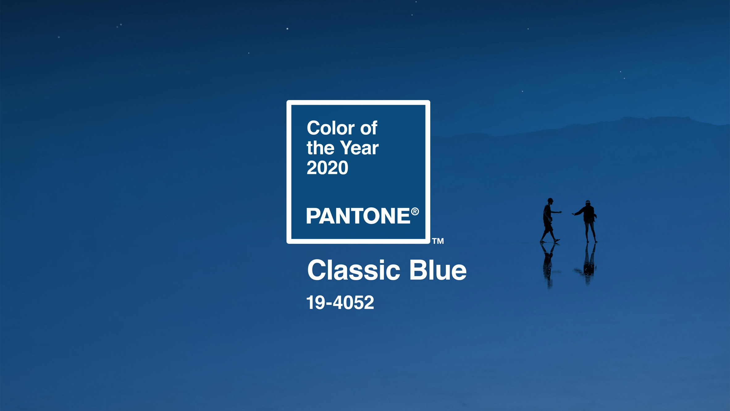
Pantone colour of the year 2020
Pantone has chosen Classic Blue (19-4052), which it describes as a “timeless and enduring blue hue…elegant in its simplicity…Suggestive of the sky at dusk, the reassuring qualities of the thought-provoking [Classic Blue] highlight our desire for a dependable and stable foundation on which to build as we cross the threshold into a new era”.
Think calming, dependable, trustworthy, timeless…the concept behind this year’s colour is that the world moves on at breath-taking speed, with new discoveries (and uncertainties) at every turn, and whilst this is exhilarating, we also yearn for calm and serenity.
Of course, Pantone’s colour experts couldn’t have known what would unfold in the world during 2020. However, it’s interesting to note that they describe technology as “racing ahead of the human ability to process it all”. Perhaps it’s also true that as we attempt to process recent wholly unexpected and distressing events – and move towards a new society post-lockdown – we will crave the ‘dependable and stable foundation’ evoked by Pantone’s Classic Blue.
How to use Classic Blue in interior design
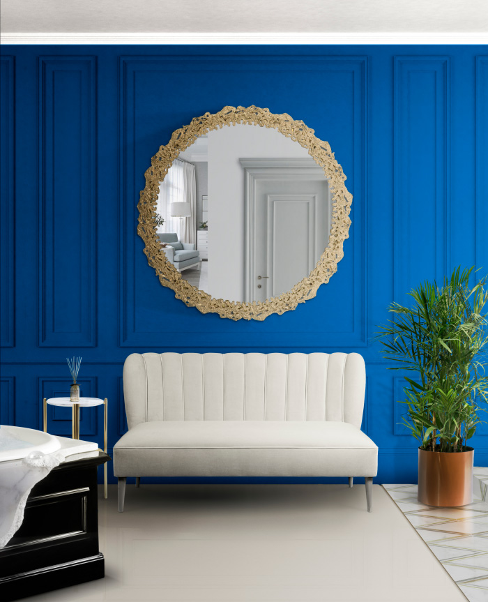
Feeling bold? Create a feature wall in Classic Blue and pair with a show stopping mirror.
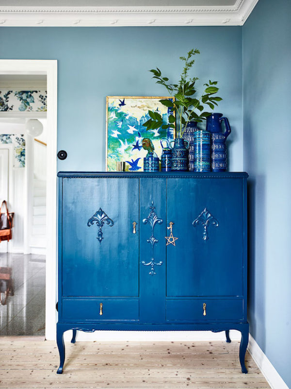
Embrace the colour trend of the year by upscaling a reclaimed dresser or cupboard. Don’t forget, you can sign up to our Pre-claim service to be the first to hear about our most interesting discoveries.
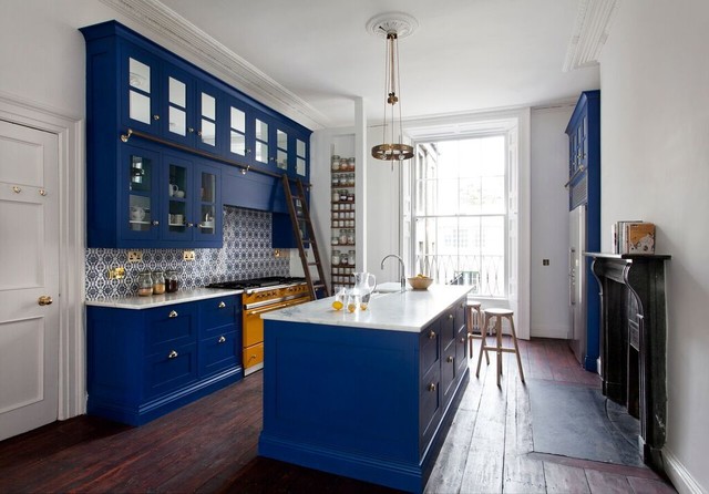
This designer has balanced a Classic Blue theme with rich mahogany wooden flooring, original oak doors, and a beautiful fireplace. Look carefully and you’ll see a contrasting pop of orange in the Aga.
Explore how to harmonise Classic Blue with other colour ways with Pantone’s Palette Explorations where you’ll find colour palettes including “Desert Twilight” and “Exotic Tastes”.
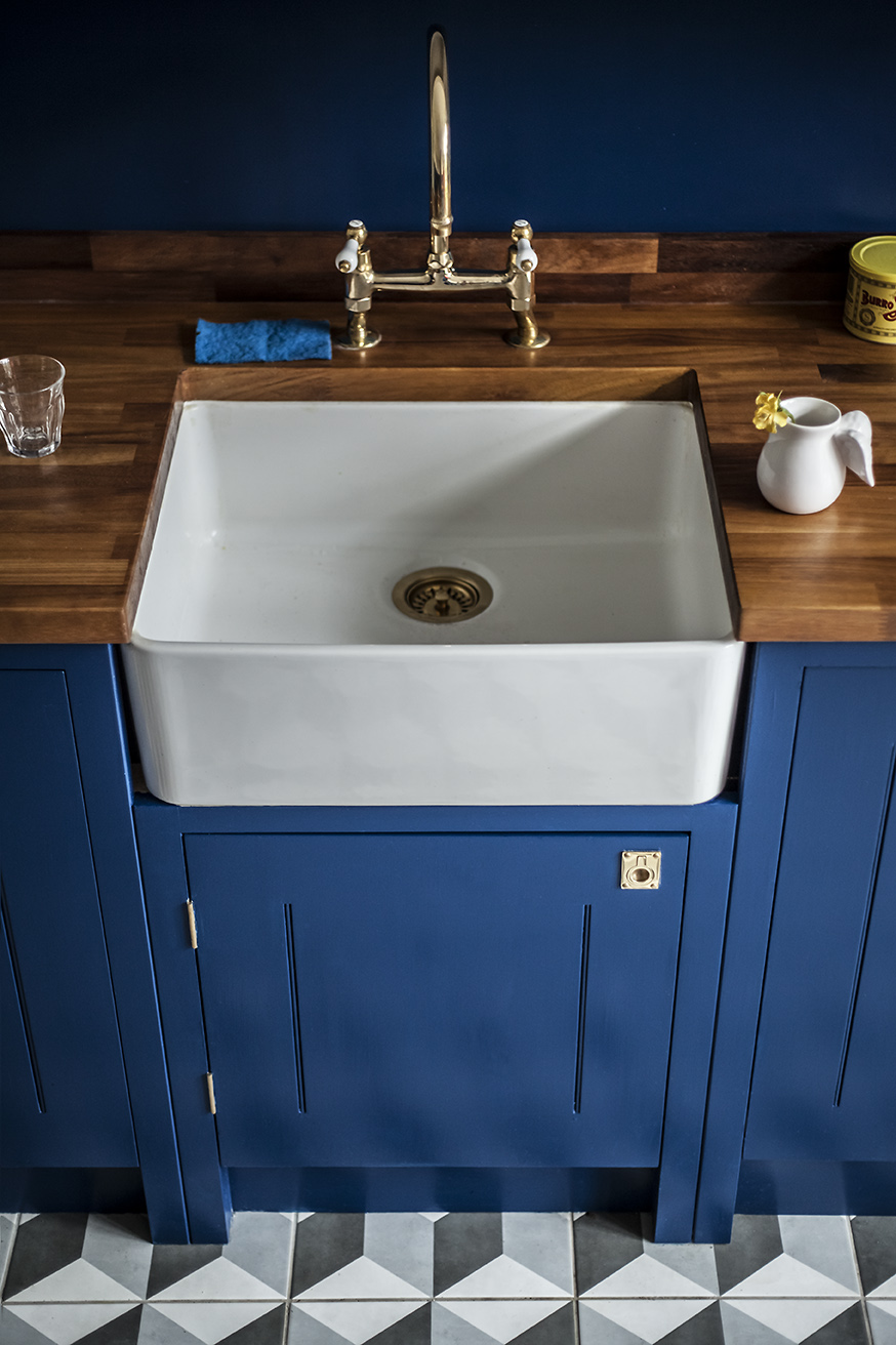
We adore this traditional blue surround with Belfast sink. The use of brass taps, matched with softer wooden tones creates a striking yet comfortable feel.
Inspired?
Give us a call to find out what’s new in stock, or come and visit us at the yard. We’re open, with strict new social distancing measures in place to protect our customers and our staff, and we’ve also introduced delivery/click & collect services.
Images
Pantone Classic Blue 19-4052: Pantone
Wall with mirror: Trend Book
Dresser: Digs Digs
Kitchen: Houzz
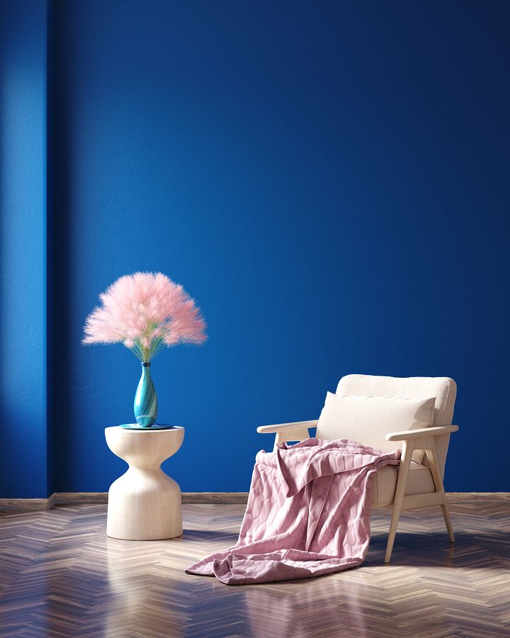
Blue with pink accent: Home Guide
Belfast sink: Remodelista